Build a custom mutator
6. Create a UI
Now that you've created, registered, and set up the mutator, it's time to consider how the user should add and remove inputs.
UI options
The best UI for your mutator is highly dependent on what the mutator does, and who the audience of your Blockly app is. There are a few options for your mutator UI:
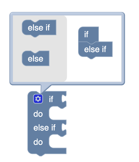
- Blockly default: Blockly mutators use a gear icon which opens up a mini workspace in which users can drag blocks to form their desired mutator shape. See the mutators guide for more information on how to implement the default UI.
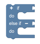
- Plus-minus: The plus-minus plugin adds + and - icons that the user can click to add or remove inputs.
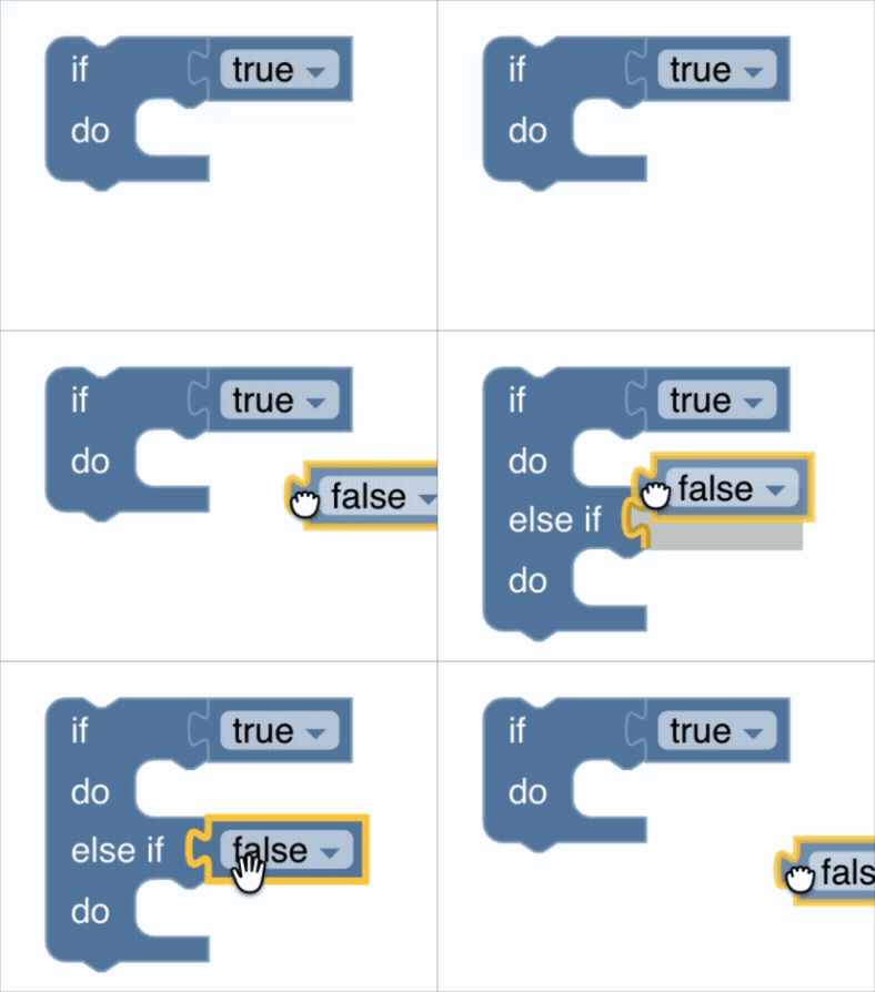
- Dynamic connections: The dynamic connections plugin automatically adds and removes inputs based on user interaction.
- Custom UI: In addition to the above options, you can also implement your own custom ways of interacting with the mutator.
Custom UI with context menus
This codelab will implement a custom UI using Blockly's context menus.
See the context menu guide for general information about context menus in Blockly. For a walkthrough of adding custom context menu items, see the context menu codelab.
Any mutator UI option has benefits and drawbacks. Using context menus to define mutator behavior is a helpful example to see how custom UI behavior can work. However, options in the context menu are not very discoverable to users, so this approach is generally not recommended unless you have a specific reason to use context menus.
Add callbacks
Two more functions complete the LIST_MUTATOR object: addConnection()
and removeConnection(). These functions can be called to add or remove an input.
They simply update the itemCount and call updateShape() to update the block.
Add the following code to the LIST_MUTATOR object:
export const LIST_MUTATOR = {
    ...

    addConnection: function() {
        this.itemCount++;
        this.updateShape();
    },
    removeConnection: function() {
        if (this.itemCount > 1) {
            this.itemCount--;
            this.updateShape();
        }
    },
};
Create the "Add Item" context menu option
First, create the context menu option that adds an input to the list. For the precondition, check if this is the right type of block. This will determine whether the "Add Item" option should be enabled or hidden.
Since the mutator is "mixed in" to the block definition, you can call
addConnection() directly on the block for the callback function.
Add the following code to index.js:
function registerAddItem() {
  const addItem = {
    displayText: 'Add Item',
    preconditionFn: function (scope) {
      if (
        scope.focusedNode instanceof Blockly.BlockSvg &&
        !scope.focusedNode.isInFlyout &&
        scope.focusedNode.type === 'resizable_list'
      ) {
        return 'enabled';
      }
      return 'hidden';
    },
    callback: (scope) => { scope.focusedNode.addConnection(); },
    id: 'add_item',
    weight: 100,
  };
  Blockly.ContextMenuRegistry.registry.register(addItem);
}
Create the "Remove Item" context menu option
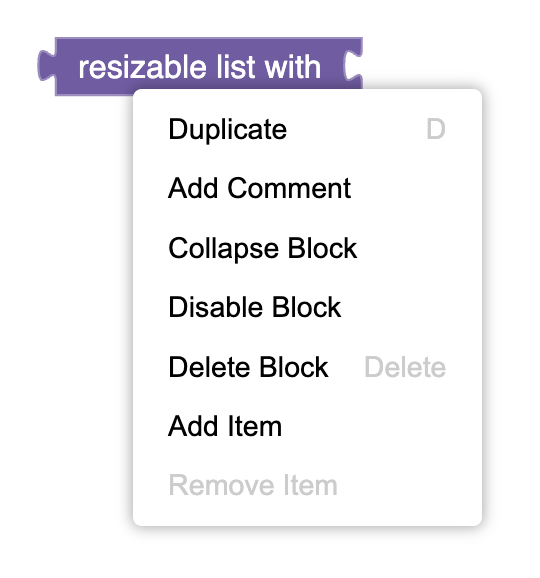
The "Remove Item" option is largely the same as the "Add Item" option. However, it also includes a guard to ensure that the total number of items will not be less than one. If there is only one input, the "Remove Item" option will be greyed out:
Add the following code to index.js:
function registerRemoveItem() {
  const removeItem = {
    displayText: 'Remove Item',
    preconditionFn: function (scope) {
      if (
        scope.focusedNode instanceof Blockly.BlockSvg &&
        !scope.focusedNode.isInFlyout &&
        scope.focusedNode.type === 'resizable_list'
      ) {
        if(scope.focusedNode.itemCount <= 1) {
          return 'disabled';
        }
        return 'enabled';
      }
      return 'hidden';
    },
    callback: (scope) => { scope.focusedNode.removeConnection(); },
    id: 'remove_item',
    weight: 110,
  };
  Blockly.ContextMenuRegistry.registry.register(removeItem);
}
Call the register functions
Finally, call both registerAddItem() and registerRemoveItem() in index.js,
just after the block and mutator registrations:
registerAddItem();
registerRemoveItem();