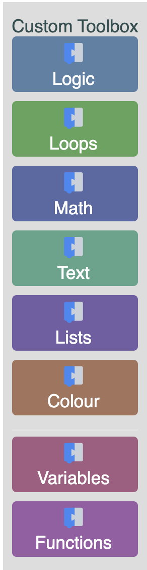
Customizing a Blockly toolbox
8. Adding a custom toolbox item
In the previous sections we modified the toolbox by extending the base category class. In this section we will make a completely new toolbox item and add it to our toolbox.
For this example, we are going to create a toolbox label.
Setup
In the same directory as index.js create a new file named toolbox_label.js.
Create a class in toolbox_label.js that extends Blockly.ToolboxItem and create a function to register it.
import * as Blockly from 'blockly';

class ToolboxLabel extends Blockly.ToolboxItem {
  // You'll add functions to this class soon

}

export function registerToolboxLabel() {
  Blockly.registry.register(
    Blockly.registry.Type.TOOLBOX_ITEM,
    'toolboxlabel',
    ToolboxLabel,
  );
}
As with the custom category, you'll also need to import the registration function in index.js.
To register the toolbox label, call the registerToolboxLabel() function in index.js, just after registering the custom category:
import { registerToolboxLabel } from './toolbox_label.js';

...

// Register the custom category
registerCustomCategory();
// Register the toolbox label
registerToolboxLabel();
By registering this toolbox item with the name "toolboxlabel" we can now use this name in our toolbox definition to add our custom item to the toolbox.
Navigate to toolbox.js, and add a toolboxlabel as the first item in the list
of toolbox contents:
{
  kind: 'toolboxlabel',
}
Your toolbox definition should now look something like:
export const toolbox = {
  kind: 'categoryToolbox',
  contents: [
    {
      kind: 'toolboxlabel',
    },
    { kind: 'category', name: 'Logic', /* etc */ },
  // ...
  ]
}
Initialize the toolbox item
In order to create a toolbox item we must implement one of the toolbox item interfaces.
For this example, we will be implementing the basic IToolboxItem interface.
There are three different types of toolbox item interfaces:
IToolboxItem, ISelectableToolboxItem and ICollapsibleToolboxItem.
Since we do not need our label to be selectable or collapsible, we can implement
the basic IToolboxItem interface.
First, we are going to add an init method to the ToolboxLabel class that will create the dom for our toolbox label:
  /** @override */
  init() {
    // Create the label.
    this.label = document.createElement('label');
    // Set ARIA role and description, so that screenreaders can see and read the label
    Blockly.utils.aria.setRole(this.label, Blockly.utils.aria.Role.TREEITEM);
    Blockly.utils.aria.setState(
      this.label,
      Blockly.utils.aria.State.ROLEDESCRIPTION,
      'Label',
    );
    // Set the name.
    this.label.textContent = 'Label';
  }
The init() function defined above includes setting the ARIA role and state for
screenreader support. To learn more, see the [screenreader support doc].(/guides/configure/screen-reader/)
Next, we are going to return this element:
  /** @override */
  getDiv() {
    return this.label;
  }
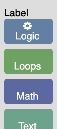
If you refresh the app page you should see a label above your first category.
Add attributes to the toolbox definition
The above code is rather limiting since it only allows us to create a toolbox
label with the text "Label".
To make it possible to create different labels with different text and colour we
are going to add name and colour attributes to our toolbox definition.
Open toolbox.js. Add a name and colour to your toolbox label
contents: [
  {
    kind: 'toolboxlabel',
    name: 'Custom Toolbox',
    colour: 'darkslategrey',
  },
  { kind: 'category', name: 'Logic', /* etc */ },
  // ...
]
These values will get passed in to our ToolboxLabel class through the toolboxItemDef.
Navigate to toolbox_label.js and add the following lines to your init method:
// Set the name.
this.label.textContent = this.toolboxItemDef_['name'];
// Set the color.
this.label.style.color = this.toolboxItemDef_['colour'];
Remove the following line from your init method:
this.label.textContent = 'Label';
All attributes on our toolbox definition get added to the toolboxItemDef_.
this.toolboxItemDef_ is set in the Blockly.ToolboxItem constructor.
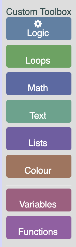
Refresh your app in a browser to see the updated label.
Add some CSS
Similar to how we added colour and name above, we are going to add a custom
class to our label.
Navigate to your toolbox definition in toolbox.js and add the cssconfig.
contents: [
  {
    kind: 'toolboxlabel',
    name: 'Custom Toolbox',
    colour: 'darkslategrey',
    cssconfig: { label: 'customLabel' },
  },
  { kind: 'category', name: 'Logic', /* etc */ },
  // ...
]
This gets added to a cssconfig object stored on the toolboxItemDef.
To use this value navigate to toolbox_label.js and add the following lines to
your init method.
const cssConfig = this.toolboxItemDef_['cssconfig'];
// Add the class.
if (cssConfig) {
  this.label.classList.add(cssConfig['label']);
}
The above code will add the class to the label. Now, in toolbox_style.css add
the below CSS to make the label bold.
.customLabel {
  font-weight: bold;
}
The result
If you refresh your app you should now see a bold dark gray label at the top of your toolbox.