Customizing your themes
5. Customize Category Styles
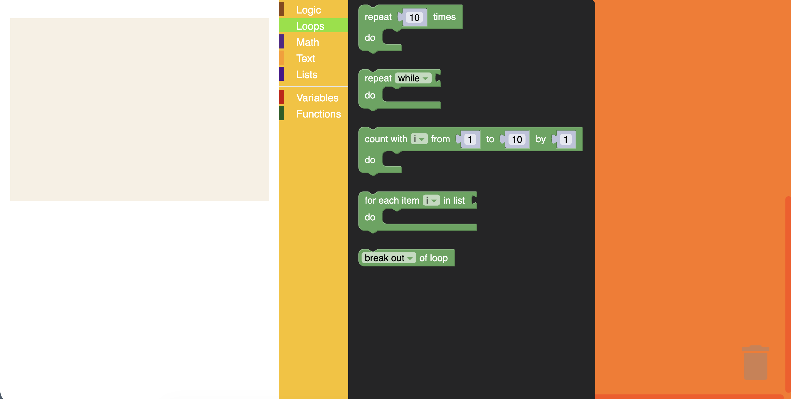
A category style currently only holds a colour property. It is the colour of the category on the toolbox. This value can either be defined as a hex value or as a hue. Usually these colours should be the same as the colourPrimary on the majority of blocks in the category making it easy for users to tell what blocks belong in what category.
Add a categoryStyles section to the theme definition in src/index.js. The sample app's toolbox includes
Logic, Loops, Math, Text, Lists, Variables, and Functions categories, so we'll provide a style for each one:
Blockly.Themes.Halloween = Blockly.Theme.defineTheme('halloween', {
  base: Blockly.Themes.Classic,
  categoryStyles: {
    logic_category: {
      colour: '#8b4513',
    },
    loop_category: {
      colour: '#85E21F',
    },
    math_category: {
      colour: '#542788',
    },
    text_category: {
      colour: '#FE9B13',
    },
    list_category: {
      colour: '#4a148c',
    },
    variable_category: {
      colour: '#cc0000',
    },
    procedure_category: {
      colour: '#1b5e20',
    },
  },
  componentStyles: {
    workspaceBackgroundColour: '#ff7518',
    toolboxBackgroundColour: '#F9C10E',
    toolboxForegroundColour: '#fff',
    flyoutBackgroundColour: '#252526',
    flyoutForegroundColour: '#ccc',
    flyoutOpacity: 1,
    scrollbarColour: '#ff0000',
    insertionMarkerColour: '#fff',
    insertionMarkerOpacity: 0.3,
    scrollbarOpacity: 0.4,
    cursorColour: '#d0d0d0',
    blackBackground: '#333',
  },
});
Test it
Refresh the page. The colour displayed next to each toolbox category should display your new colours. Clicking on a category will highlight the row with your new colour.