Customizing your themes
4. Customize Components
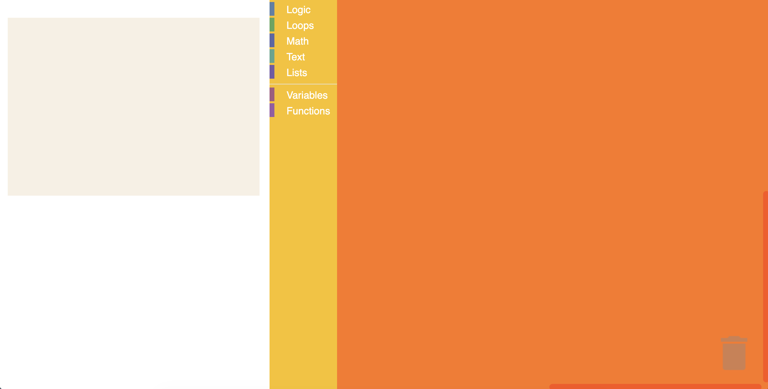
Within the Halloween theme definition in src/index.js, you can customize the colours of multiple components. Update the theme definition to add the componentStyles shown below:
Blockly.Themes.Halloween = Blockly.Theme.defineTheme('halloween', {
  base: Blockly.Themes.Classic,
  componentStyles: {
    workspaceBackgroundColour: '#ff7518',
    toolboxBackgroundColour: '#F9C10E',
    toolboxForegroundColour: '#fff',
    flyoutBackgroundColour: '#252526',
    flyoutForegroundColour: '#ccc',
    flyoutOpacity: 1,
    scrollbarColour: '#ff0000',
    insertionMarkerColour: '#fff',
    insertionMarkerOpacity: 0.3,
    scrollbarOpacity: 0.4,
    cursorColour: '#d0d0d0',
    blackBackground: '#333',
  },
});
Test it
If the server is already running, refresh the page to see the new changes. Otherwise, run npm start to start the server. You should see a themed workspace!
You may notice that the code output window looks the same. This is because the code output window is not part of the Blockly workspace. The code output window will remain unchanged throughout this codelab, but you are encouraged to experiment with changing this style.
tip
Try adjusting the CSS for the output pane (found in index.css) to match your Blockly theme!