Anatomy of a field
Value
All fields are required to have a value, which is the source of truth for the field's data. This can be of any type (string, number, array, date, etc). Fields may use validators to restrict values or translate to a machine-readable format (e.g. normalizing date formats).
Text
All fields contain text, which is a simple human-readable string representing
the field's value. This does not necessarily mean they are the same. For
instance, the text on a boolean field may be ‘On' or ‘Off', while its value is
true or false.
This text is what is displayed when the block is collapsed, for accessibility, and may optionally be part of the on-block display.
Editable vs non-editable fields
In general, editable fields allow the user to make changes to the code, while non-editable fields display information to the user about the block. Editable fields may show a rich editor when clicked or activated with the keyboard.
Editable fields include:
Non-editable fields include:
Focusable vs non-focusable fields
Focusable fields can be navigated to and acted on with the keyboard. A field is focusable if it is visible and clickable or currently editable. Some non-editable fields are focusable, such as images with click handlers. If a field is focusable it must specify a single focusable element to be visited when traversing blocks. Blockly ensures that the focusable element is in the accessibility tree in an appropriate location.
Non-focusable fields such as labels cannot be navigated to with the keyboard.
ARIA label
All fields have an ARIA label, which is a string containing human-readable information about the field's type and value. Blockly exposes the ARIA label to screen readers by attaching it to the field's focusable element or including it in the parent block's ARIA label. All built-in fields compute their ARIA labels automatically.
Serialization
A serializable field's value gets encoded in the save format (JSON or XML). All editable fields are serializable, because their values are dynamic. Non-editable fields' values are usually not dynamic, so they are usually not serialized.
Serialized fields include:
Non-serialized fields include:
Note how the Label Serializable field is not editable, but is serializable. This means that it can only be edited programmatically, rather than through a user-visible UI. Once edited, its value is encoded in the generated JSON/XML.
Code generation
Besides connecting and disconnecting blocks, fields are the only way that the user can control the code generated by Blockly. The editor provided by a field lets the user modify the value stored by the field. The block's generator may then access the field's value for use in the generated code.
For more information about using a field's value in a generator see field code generation.
On-block display
A field's on-block display is a collection of SVG elements representing the field's value. They take up space on the block, and as they change size they force the block to change size. A field's on-block display can be simple or complex, depending on its needs.
These are some examples of different on-block displays, in order of increasing complexity.
| Field type | Description |
|---|---|
| Label | Contains only a text element. |
| Angle | Contains a background rect, text element, and a degree symbol. |
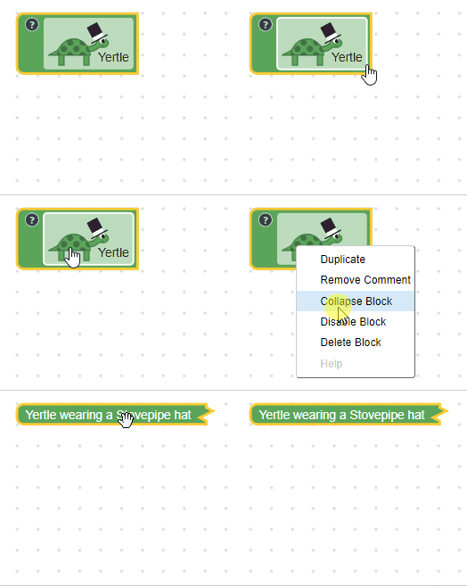
| Turtle | Contains a background rect, text element, and many SVG elements used to construct the turtle graphic. |
Focusable fields must designate a focusable DOM element with a unique ID for
their on-block display. Blockly places this element in the accessibility tree
and moves focus to it through keyboard navigation. When the field is focused its
focusable DOM element will have the blocklyActiveFocus or
blocklyPassiveFocus CSS class added. Blockly's built-in fields show focus
with a yellow outline.
The focusable element must have the correct ARIA role. Most focusable fields
have an ARIA role of button to indicate that they can be clicked or activated
with the keyboard. An exception is the checkbox field, which has an ARIA role
of checkbox. Non-focusable fields should be removed from the accessibility
tree by applying aria-hidden to the root of the field.
Editor display
When a user clicks on an editable field, the field may display an arbitrarily complex editor.
These are some examples of different editors, in order of increasing complexity.
| Field type | Description |
|---|---|
| Checkbox | No editor when clicked. The on-block display updates. |
| Number input | Text editor overlaid above the on-block display. Users can type; the editor may change color to indicate bad values. |
| Angle picker | The angle picker has both a text editor for typing numbers and a draggable editor for selecting angles visually. |
Blockly automatically moves focus into the field editor when activated. The developer is responsible for the accessibility of their field editor, including setting appropriate ARIA role and properties.
Other display modes
Collapsed mode: the user collapses the block.The block displays a text representation of its values, using the text returned by the individual fields.